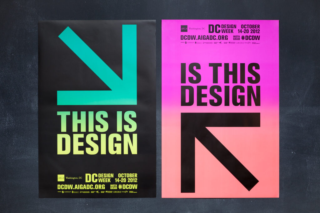
AIGA’s Design Week was meant to be inclusive of the design community, outside of traditional “graphic artists.” Think architects, interior, web, and industrial designers. We devised the theme of “Is This Design/This Is Design” to consider exactly what is and isn’t design, who is and isn’t a designer, and be more inclusive in the process.
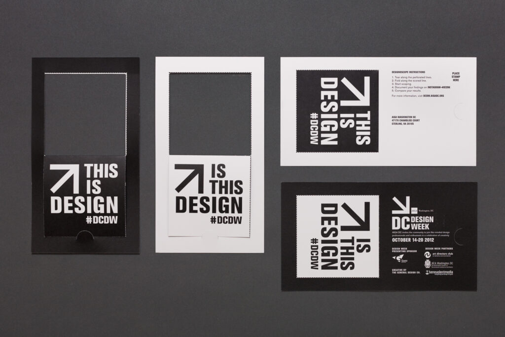
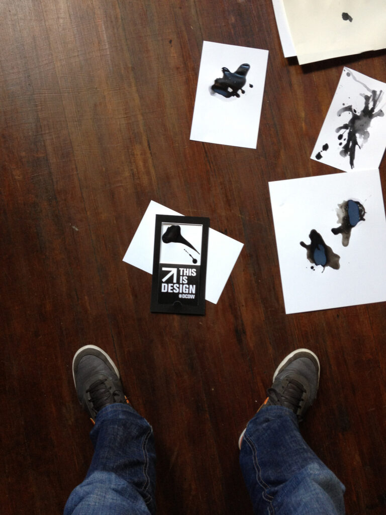
A simple save-the-date card transforms into a sophisticated design-o-scope, a tool to find and consider design. (Okay, it’s a card with a perforated hole in it that alternately asks “Is this design?” and states “This is design.”) But really, it shows how a simple technique can transform a piece of paper into something more.
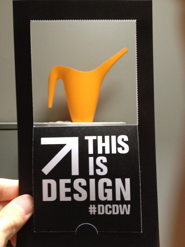
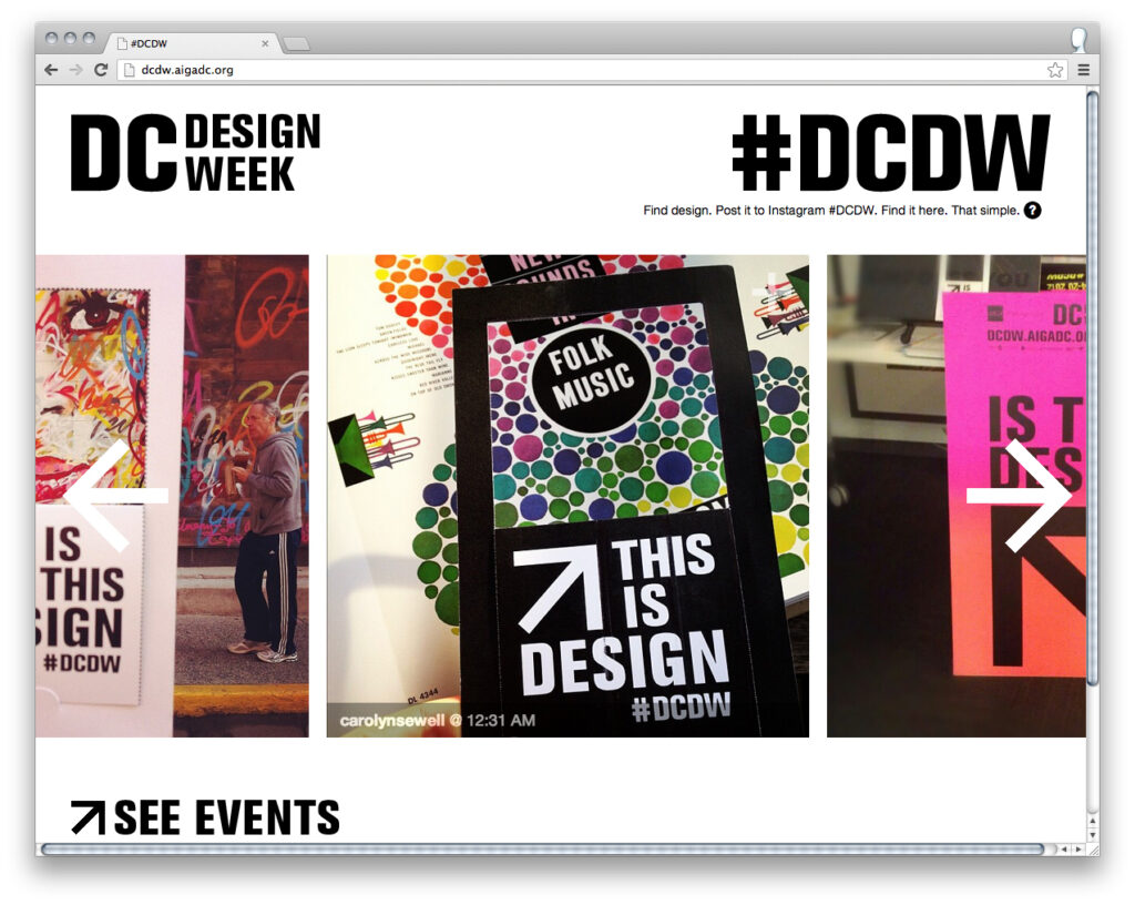
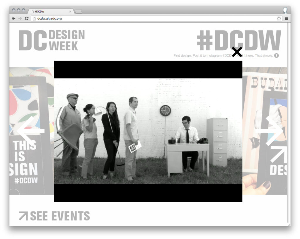
We built a microsite. When you posted your design-o-scope images with #DCDW the site compiled all the images. Then we took our design-o-scope joke even further with an explainer video, “Help Desk.” I wrote a short script, called in a few favors and we had some fun.
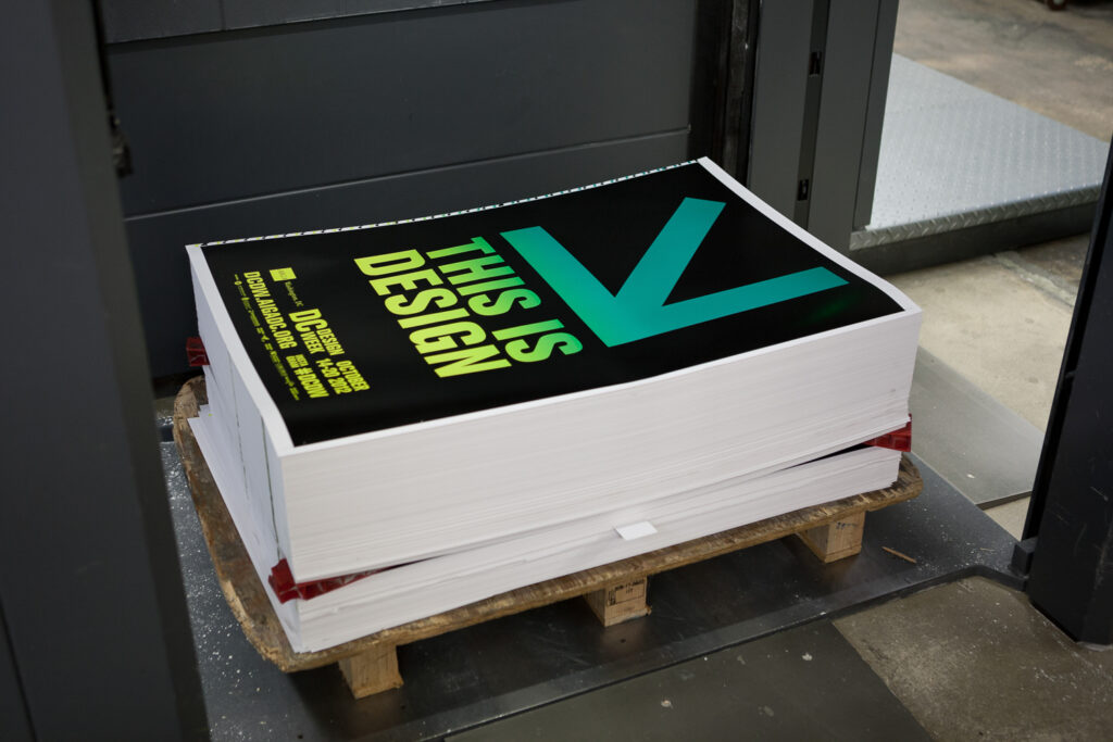
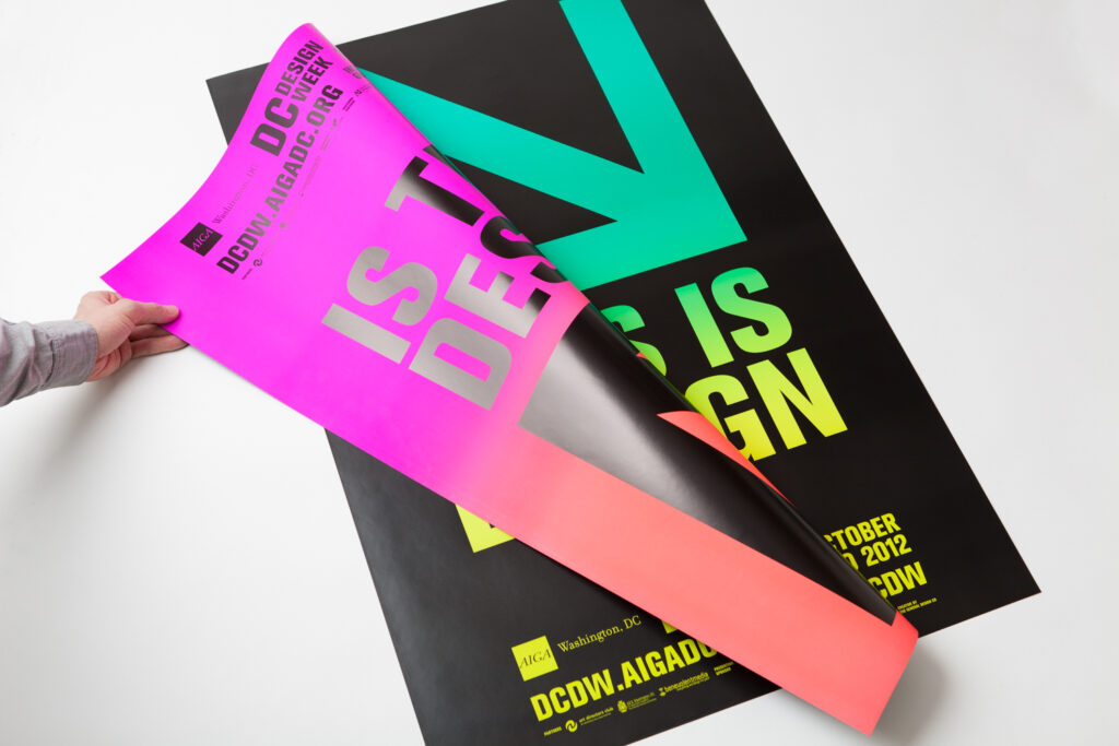
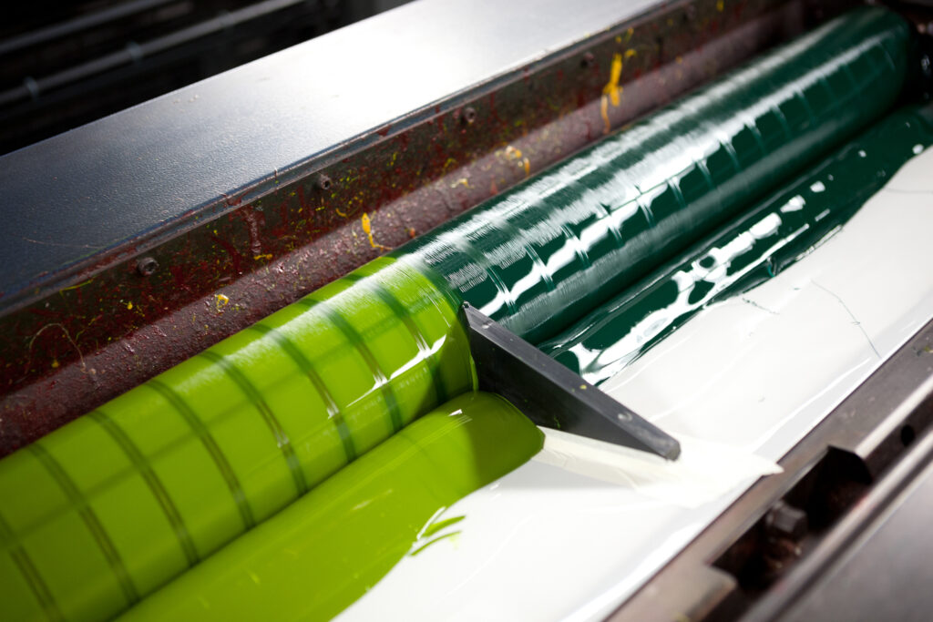
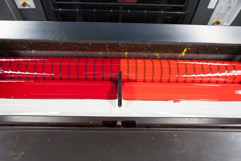
In-kind donations from printers and sponsors meant there wasn’t a lot of budget to go around, but it was an opportunity to let our print partners strut their stuff. Split fountain printing is a technique where two (or more) colors are carefully loaded into the press which then bleed together to create a continuous (and shifting) gradient. We chose neon inks to contrast with our monochrome color palette.

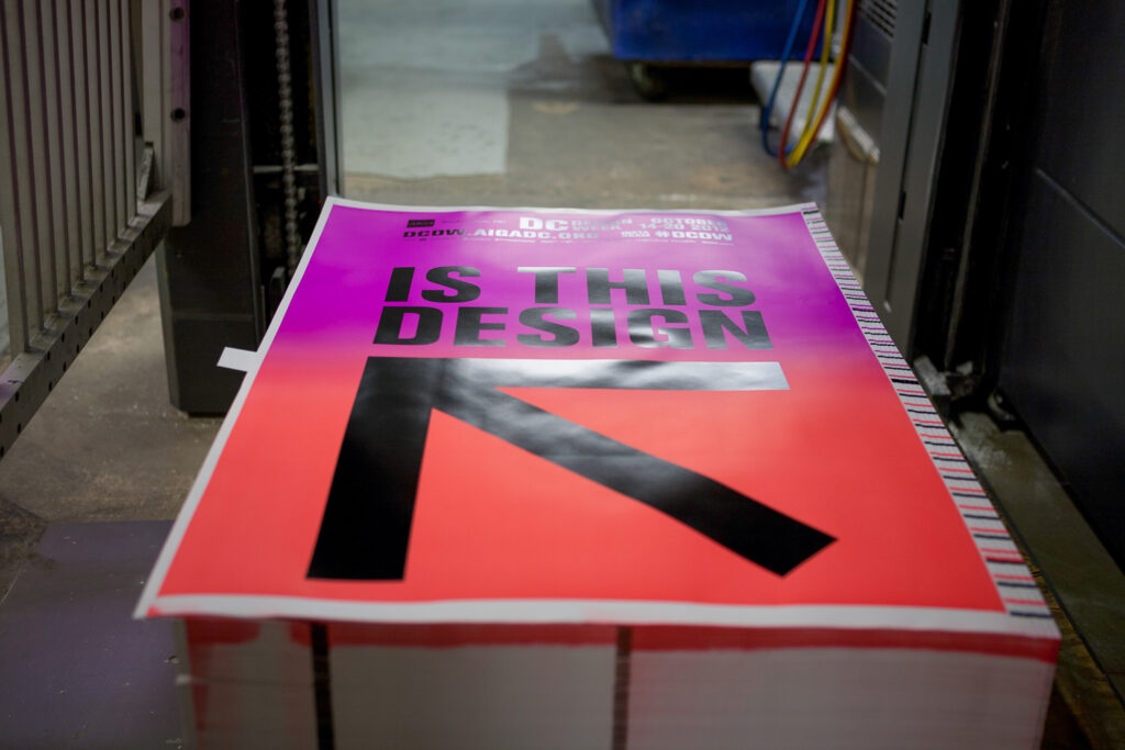
My favorite aspect of the poster was the spot varnish applied to the black ink on the “Is This Design” side. That adds a sheen only to the black ink. In some lighting conditions you don’t notice it, but when light hits the poster just so, you become aware of the surface of the sheet, the smooth matte of the neon gradient, and the subtle sheen and rich contrast of the black ink.